Stripe's obscuring tooltips
Sliiiiiiddddee to the left. Sliiiiiiddddee to the right.
How to fix itBad designs are everywhere. Let's fix them.
Sliiiiiiddddee to the left. Sliiiiiiddddee to the right.
How to fix itThere are two ways to exit this view. But it's not clear why.
How to fix itThe button to continue in this return process is so light that it looks disabled.
How to fix itThis movie is called Cherry. Who would know?
How to fix itDon't mess with the expected order of small, medium, large.
How to fix it🤷♂️
How to fix itThe largest, most central action in YouTube's bottom nav is a plus button/icon for going live or uploading a video.
How to fix it
The AWS status page uses icons/symbols to denote the current status of various services, but you have to scroll way too far to find the box explaining what they mean.
How to fix it
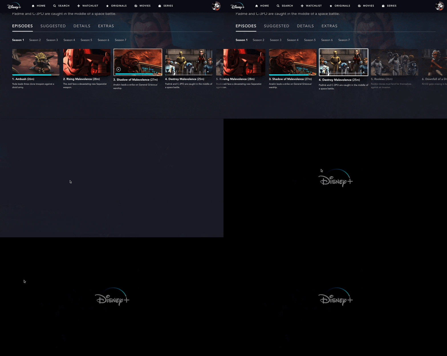
Dragging on the carousel and releasing your mouse registers a click and plays whatever was 'clicked'.
How to fix itUp there in the top right. Those supposedly convey how you see your timeline.
How to fix itYellow is almost never the right color to use.
How to fix itApple's share icon, AKA the 'squarrow', does a lot more than just share.
How to fix itWhat's selected here? Hint: it's not the magnifying glass.
How to fix itThese squares are apparently checked checkboxes. There's just no checkmark.
How to fix it