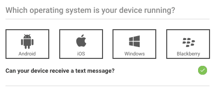
Some initial context: this came from 2FA enrollment on a banking website.
We’ve got a bunch of brand logomarks being used as icons to represent different devices, as indicated by the “Select Your Device” label. What kind of devices? Well, that’s unclear.
These logos represent the operating system running on a device. Android isn’t a brand of phone, it’s an OS that runs on thousands of different devices from hundreds of different brands.
Most of these logos won’t mean anything to anyone who isn’t particularly tech savvy or tech aware, especially since this shoddy design came from a banking website whose customer base is as broad as it gets.
I bet less than 10% of the population knows the last one is the Blackberry logo.
Solution
I’m not sure why this is needed at all. If they’re enrolling in 2FA, just ask how they’d like to receive their 2FA code: text, email, phone call.
But if it’s necessary, a slight improvement would be to change the label text to “Which operating system is your device running?” and to add some OS names under each logomark.
