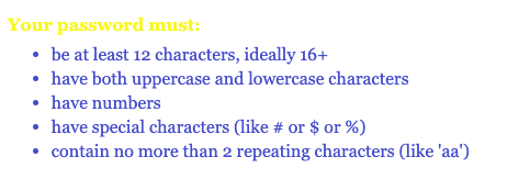
Yellow is a troublesome color, especially for text. It’s very hard to read and requires a dark color behind it to achieve the correct amount of contrast.
This example is from a bank website, which is almost cheating if you’re looking for examples of bad design.
A lot of people could probably look at this and understand that it’s a list of password requirements. But it’d be nice if the text describing what must “be at least 12 characters, ideally 16+” was readable.
You’d think the institutions that handle everyone’s money would want to invest in better design, but they fall short all the time.
Solution
Avoid using yellow, and if you must, make sure the contrast with the background color is sufficient.
Use this to check your contrasts.
If you’re using yellow to draw a user’s attention to something, think of a better way to catch their eye than using a color that’s usually not eye-catching.
Bonus
These buttons were also everywhere on this site. They’re not as bad as yellow, but they technically fail a contrast check.

