Webull has been among the many trading apps making waves recently because of all the $GME furor.
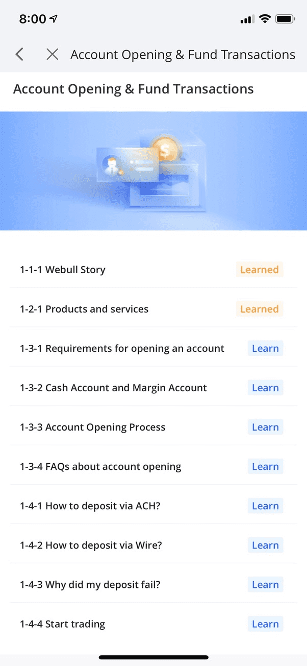
This screen is from their training section that explains how their app works. If you take a look at the top left, you’ll see a back arrow/chevron and an X right next to each other. Why are there two of them? Which one takes me back a page?
It’s not as terrible as it could be because the back arrow does take you back one step in the navigation and the X takes you back to the root page you started on. But why is that needed?
The two are so close together that it’s easy to accidentally hit the wrong one. And their proximity makes it confusing to know which is the right one to use.
Another thing adding to the confusion is the way that the navigation renders a new view. It sort of just pops on top with no animation or any sense of direction. Without that, it’s difficult to intuit which button is the right one to dismiss the current page and return back a step. The X makes it seem like each new view is more of a modal that is appearing on top of the other content, while the back arrow suggests that there’s a stack of navigable pages you can move through.
Also, the two buttons/icons right next to each other makes the text off center, which isn’t great.
Solution
Use one button and make it the back arrow.
None of the views in this traning are so deeply nested that it would be hard to go back a few steps. Even better would be an additional button towards the bottom of each article that says “Complete Lesson” which returns you back to the list of lessons.
