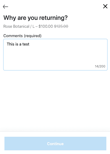
I was returning a backup Christmas gift and came across this ‘Continue’ button that I did not know I could click.
Since the comments section is required here, I assumed that once I typed something in the button would be enabled.
But it stayed the same color.
White text and light background color immediately signals that the button is disabled. Except in this case, it’s not disabled.
If you’re a real cynic, you might call this an anti-pattern to disuade people from returning things. I think it’s just something that’s been overlooked and is a consequence of making brand colors more important than a well designed UI.
Solution
Make the button a darker blue at the very least.
Since the comments are required, it would be better to have the button appear disabled with a lighter background color, and then for that background color to change to a darker color when comments have been added.
